Designing Urgência Agora for Portugal’s Advanced Computing Competition: Building an AI Powered Healthcare App
Healthcare systems are already stressful. Accessing information during urgent moments should not make things worse.
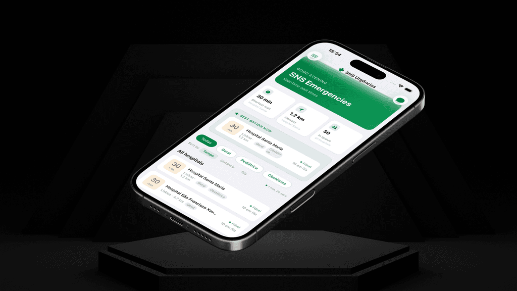
That thought became the starting point for Urgência Agora, a native iOS application designed to make emergency healthcare information in Portugal more accessible, understandable, and less overwhelming.
What makes this project unique is not only the problem it tried to solve, but also the process behind it. I designed and built the app in just 3 weeks with zero prior experience in Swift or Xcode, using Claude AI as my pair programmer throughout the journey.
More importantly, the app was developed and submitted as part of the Concurso de Projetos de Computação Avançada (6ª edição) by Fundação para a Ciência e a Tecnologia (FCT), a national Portuguese initiative supporting innovative projects in advanced computing, AI, and digital innovation. The project was submitted under the A0/A1 experimental and development access categories focused on emerging computational solutions.
This project became more than an app. It became an experiment in design thinking, AI assisted development, rapid learning, and human centered problem solving.
The Problem
In Portugal, people often struggle to quickly understand which hospitals have the shortest emergency room wait times, especially during stressful or urgent situations.
Existing information around emergency rooms and hospital availability often feels fragmented, difficult to interpret, or not designed around the emotional reality of someone needing immediate guidance.
When people are stressed, anxious, or in pain, cognitive load matters.
Users do not want to:
Open multiple websites
Compare unclear information
Interpret medical terminology
Navigate confusing systems
Spend extra time making decisions under pressure
The core problem was not only about access to data.
It was about accessibility of understanding.
How might we reduce stress and decision fatigue during urgent medical situations through clearer and more human centered digital experiences?
Starting With Research Before Design
Before opening Figma or writing a single line of code, I spent time understanding how the Portuguese emergency healthcare ecosystem worked.
I researched:
The SNS 24 ecosystem
Public healthcare datasets
Emergency room wait time systems
Manchester triage categories
Hospital operational flows
Existing healthcare applications and interfaces
One thing became immediately clear:
The data already existed.
SNS 24 had publicly available emergency room information, which is honestly an incredible initiative for public transparency and healthcare accessibility.
The issue was not the lack of information.
The issue was how the information was experienced.
Most existing systems focused on displaying data, not helping humans make decisions under stress.
That distinction shaped the entire UX direction of the product.
Designing for Stress, Not Just Utility
Most apps are designed for users in neutral emotional states.
Healthcare emergencies are different.
During urgent moments:
Attention spans shrink
Anxiety increases
Decision making becomes harder
Users scan instead of read
Clarity becomes more important than features
Because of this, the UX principles behind Urgência Agora became:
Reduce cognitive load
Prioritize speed and clarity
Surface the most important information first
Make decisions feel easier
Avoid overwhelming interfaces
Instead of creating a complex healthcare platform, I focused on designing a calm decision making tool.
Defining the Core Experience
The main user need was simple:
“Help me quickly understand where I should go.”
That insight drove the product structure.
The app focused on:
Real time emergency room wait times
Live hospital rankings
Manchester triage breakdowns
Clear visual hierarchy
Fast hospital comparison
Apple Maps integration for immediate directions
Favorites for quick access
Bilingual accessibility
An AI health assistant called Lusia
Every feature had to answer one question:
Does this reduce friction during urgent moments?
If not, it did not belong in the experience.
UX Decisions That Shaped the Product
1. Information Hierarchy First
The most important information always needed to be visible immediately.
Users should not need multiple taps to understand:
Which hospital is less crowded
Estimated wait times
Severity breakdowns
Distance and directions
This heavily influenced layout decisions and visual hierarchy throughout the interface.
2. Designing Around Emotional States
One of the biggest UX considerations was emotional design.
Most healthcare apps feel cold, institutional, or overwhelming.
I wanted Urgência Agora to feel:
Calm
Clear
Human
Reassuring
The interface avoided unnecessary complexity and focused on clarity over decoration.
3. Reducing Interpretation Work
Healthcare systems often force users to interpret too much information themselves.
Instead of simply displaying raw data, the app tried to make the information easier to understand through:
Rankings
Simplified comparisons
Clear labels
Structured visual grouping
Accessible navigation patterns
The goal was not just visibility.
It was comprehension.
From Figma to Native iOS Development
Once the UX direction was clear, I designed the interface and flows entirely in Figma.
Then came the biggest challenge:
Building the actual app.
At the start of the project, I had zero experience with:
Swift
Xcode
Native iOS development
This is where Claude became a major part of the process.
Instead of using AI to replace thinking, I used it as a collaborative learning and development partner.
Claude helped me:
Understand Swift fundamentals
Structure components
Solve development problems
Debug issues
Translate UX ideas into functional interfaces
Learn native iOS patterns step by step
What fascinated me most was how AI accelerated the gap between idea and execution.
As a designer, I could move much faster from concept to working product without being blocked by technical inexperience.
Building With AI Changed My Design Process
This project completely changed how I think about product creation.
Traditionally, design and development can feel separated:
Designers create concepts
Developers execute them
With AI assisted workflows, that line started to blur.
I could:
Prototype ideas faster
Test interactions immediately
Iterate in real time
Learn technical systems while building
Think more holistically about product design
It became less about static screens and more about designing complete experiences end to end.
The Final Product
In just 3 weeks, Urgência Agora evolved from an idea into a fully functional native iOS application.
The final app included:
Real time SNS emergency room wait times
Live hospital rankings
Manchester triage breakdowns
AI health assistant integration
Apple Maps directions
Favorites system
Bilingual support
Native iOS interactions and flows
But beyond the features, the project represented something bigger:
Using design thinking and AI assisted development to solve real world public healthcare problems quickly, accessibly, and independently.
Reflections
Urgência Agora taught me that good UX is not only about usability.
It is about understanding human behavior during emotional moments and designing systems that reduce friction, uncertainty, and stress.
It also showed me how AI can dramatically expand what designers are capable of building independently.
Three weeks earlier, I had never opened Xcode.
Three weeks later, I had designed and built a healthcare app solving a real public accessibility problem, while simultaneously submitting the project to a national advanced computing and AI innovation initiative supported by the FCT.
And honestly, that might be the most exciting part of where product design is heading.
date published
Mar 16, 2026
reading time
5 min