Redesigning Snapchat UI: Case Study on app design evolution
After diving into hospitals and juice bars in my first two projects, I decided to take on something a little different this time: Snapchat. I used to use it all the time, and opening it again felt… nostalgic, but also dated. The UI felt frozen in time, almost like the app hadn’t grown up alongside its users. For an app that shaped how we communicate visually, that was surprising to me.
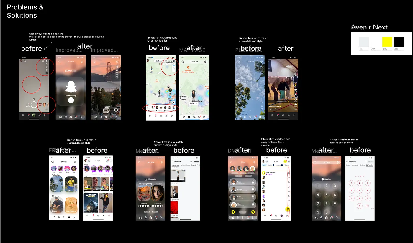
But more importantly, it still opened straight to the camera. At first, that feels fun, but in practice, it creates a lot of awkwardness and risk. I can’t count the number of public stories I’ve read, personal stories I’ve heard about people accidentally sharing private moments because the app launches with the camera already rolling. What started as a clever differentiator has now become a liability.
That became my focus: what if Snapchat rethought its entry point and UI for today’s users?
The Problem
I started with a heuristic analysis of the current app. Three issues kept popping up:
Visibility of system status — feedback was often unclear, especially after recording or sending snaps.
User control and freedom — opening directly into the camera left users feeling exposed, not in control.
Consistency and standards — navigation relied heavily on hidden swipes, which isn’t intuitive for new users anymore.
These principles gave me a clear set of usability goals: clarity, control, and consistency.
Competitor Analysis
Next, I looked at Snapchat’s biggest peers: TikTok and Instagram.
TikTok makes video the centerpiece, but has really strong hierarchies and a clear entry flow.
Instagram has evolved its navigation bar over the years, always keeping it familiar and discoverable.
Compared to them, Snapchat’s interface felt cluttered and stubbornly loyal to old patterns. It hadn’t made the same design evolutions its competitors had.
My Approach
Since this was a design-only sprint, I skipped surveys and interviews and instead leaned on:
Mapping existing flows → Where were the biggest friction points?
Moodboarding → What should Snapchat feel like today? Playful, yes. But also clear and respectful.
Wireframing + high-fidelity redesigns → Exploring what a modern entry point (other than the camera) could look like.
My Redesign
A Safer Entry Point
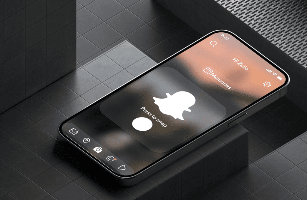
Instead of dropping users straight into the camera, my redesign lands them on a Home hub — a lightweight screen that gives context. From here, the camera is still one tap away, but the user feels in control from the start.Camera as a Choice, Not a Default
The camera is still the hero, but now it’s framed as an intentional action, not a reflex. This reduces the chance of oversharing and makes opening Snapchat feel less jarring.Modern Navigation
I introduced a bottom nav bar for clarity, while keeping swipe gestures for power users. Stories, Chat, and Spotlight all live here, with the camera still central but no longer invasive.Cleaner Visual Language
Softer gradients, same typography, and more breathing space. The goal was to keep Snapchat playful but strip away the clutter. I also gave it a makeover with the newest (and controversial) design trend “Liquid Glass”
Final Thought
Redesigning Snapchat reminded me that design decisions age just like people do. What once felt new, going straight to the camera, now feels careless in a world that’s more conscious about privacy.If I had more time, I’d love to test whether longtime users embrace this change, or if they’d miss the instant camera. But as a sprint, this was about showing that even sacred cows in design can (and sometimes should) be questioned.
Snapchat taught us to share in the moment.
My redesign asks: can we keep that spirit alive, while respecting the user’s control and privacy in 2025?
date published
Aug 25, 2025
reading time
5 min