NutraDiva: An UX/UI Case Study
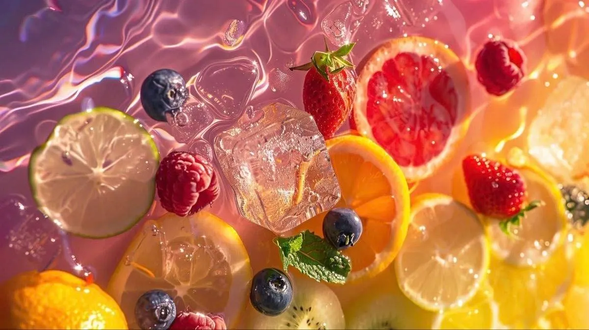
After tackling the complexity of public hospitals in my first project, my second Ironhack sprint gave me the chance to dive into something far more personal and vibrant: NutraDiva, a local juice bar in Delray Beach, Florida.
NutraDiva isn’t just a shop it’s Marsha, the founder and the driving force behind the brand.
The problem? Her website felt flat and clunky, completely disconnected from the living brand she had created offline.
Together with Camille and Chantal, our mission was simple to describe but tricky to deliver:
Make the online experience feel as fresh, authentic, and effortless as the juice itself.
Phase 1: Listening
We began by grounding ourselves in context. I explored industry trends noticing the rise of “functional juices” (detox, immunity, gut health) and looked at Delray Beach’s unique demographic: mature, wellness-driven, and very willing to pay for quality.
But the most eye-opening moment came when we sat down with Marsha. She’was straight to the point. Her challenge wasn’t brand vision (she had plenty of that) it was time and process. Orders were booming, but the system for managing them was messy and stressful. She needed a website that worked for her as much as for her customers.
That conversation set the tone for the rest of our project.
Phase 2: Finding the Gaps
We ran a quick survey to dig into online ordering behaviors. Crafting the questions was harder than expected due to our tendency to perfectionism (something I’ll touch on later). With Camille and Chantal, we trimmed it down to the essentials and ended up with 28 responses.
A few things stood out:
Users wanted ordering to feel clear, fast, and transparent.
Too many juice websites were overwhelming and cluttered.
Trust in the brand mattered just as much as the product itself.
This gave us our design purpose: simplicity with personality.
Phase 3: From Data to People
We mapped all insights on the wall (imagine sticky notes everywhere). Patterns started emerging around three themes: trust, ease, and energy.
From this, we shaped our persona: Lilly Lemon a wellness-focused professional who values health but doesn’t have time for complicated shopping. She wants a digital experience that’s both credible and delightful.
Building Lilly’s journey showed where things usually broke down:
discovering the brand,
trusting the product,
completing the order without frustration.
This exercise gave us clarity and, honestly, motivation. Designing for “Lilly” felt far more real than designing for “a user.”
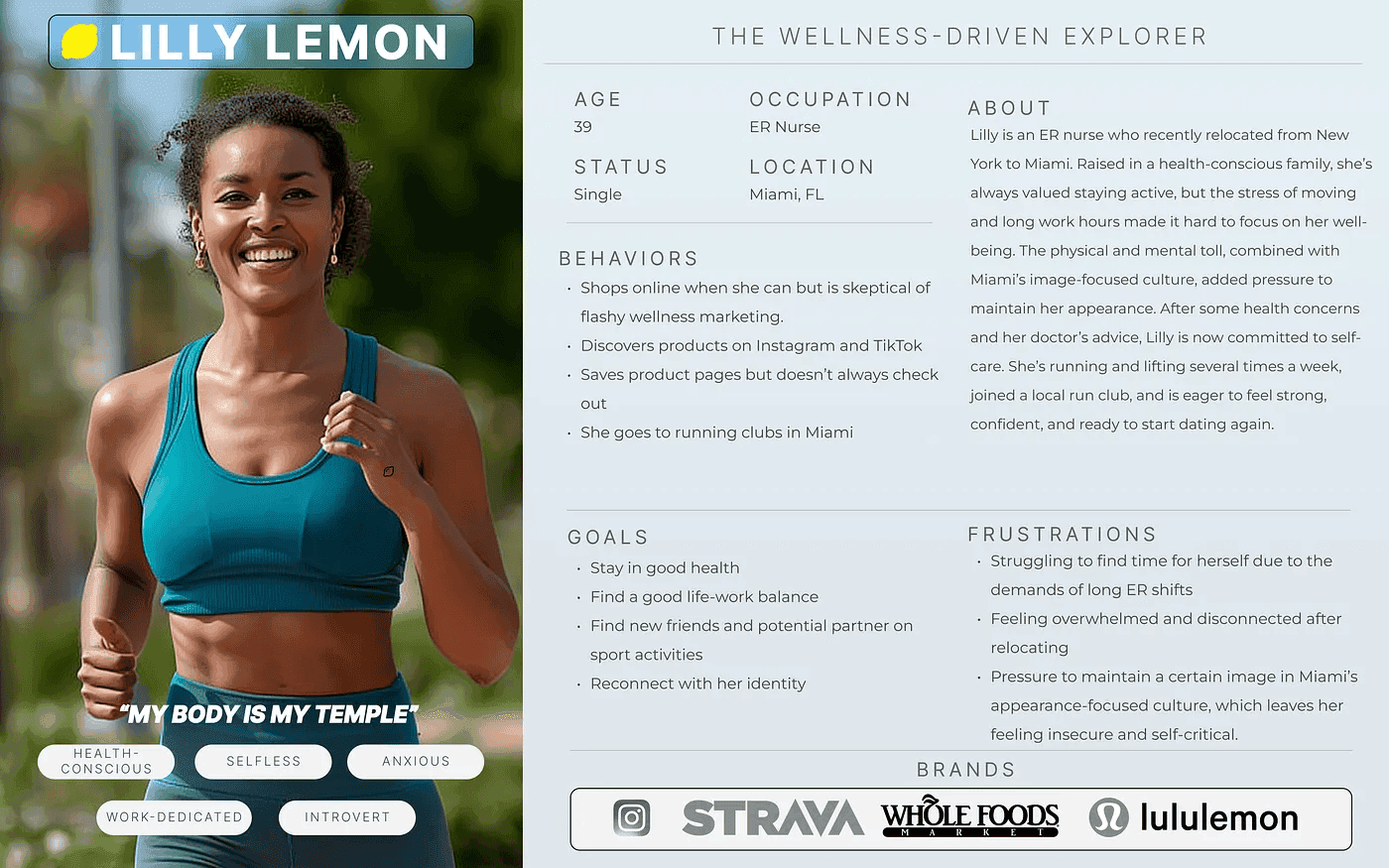
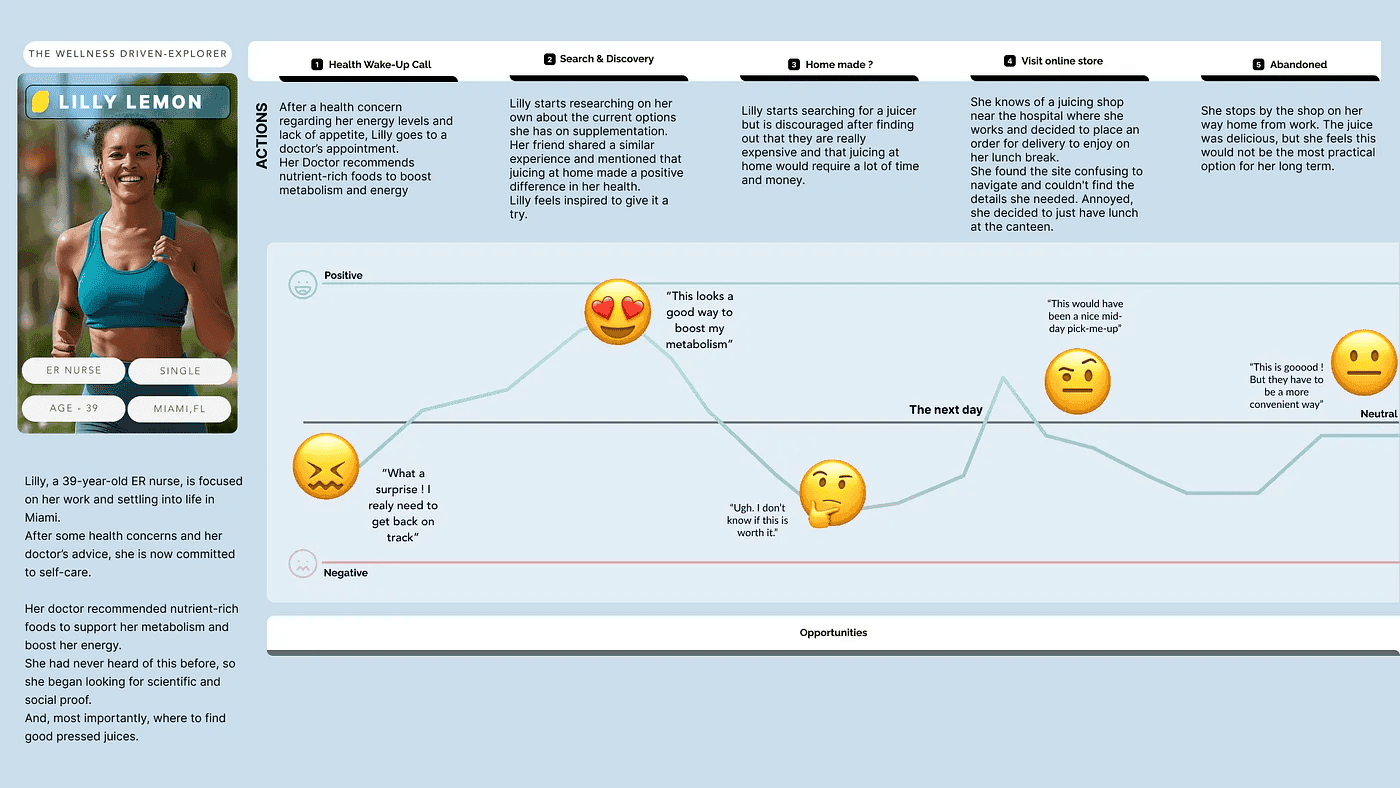
Introducing Lilly Lemon and her UJM
Phase 4: Givin’ It More Marsha
With direction in place, we sketched flows and built a moodboard to capture NutraDiva’s soul. Where other juice sites leaned sterile or generic, we leaned into fresh, confident, and community-driven.
The user flow boiled down to five clean steps from landing on the site to checkout. Aiming for just clarity.
The moodboard became our anchor. Bright, bold, and authentic it was less about “what juice looks like” and more about “what Marsha feels like.” That made all the difference.
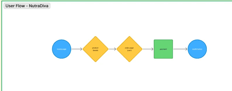
User Flow
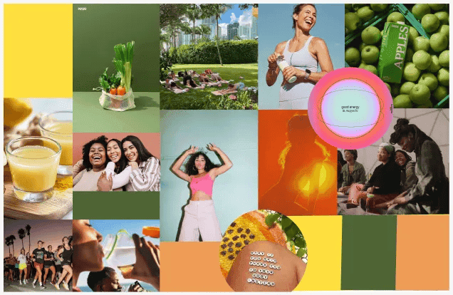
NutraDiva Moodboard
Phase 5: Sharing ‘Diva to the World
We prototyped quickly: lo-fi first, then mid-fi with mobile as our starting point. Dot-voting helped us merge the strongest pieces from each of our sketches.
Testing revealed two things:
The streamlined flow really resonated. People liked how easy it was to navigate.
We still had too much content to communicate in too little time. Presentation day made this crystal clear our research and ideas were solid, but the delivery felt a bit rushed.
Because of the timeline, we couldn’t polish a high-fidelity prototype, but we showed how the mid-fi already captured the spirit of what NutraDiva could become.
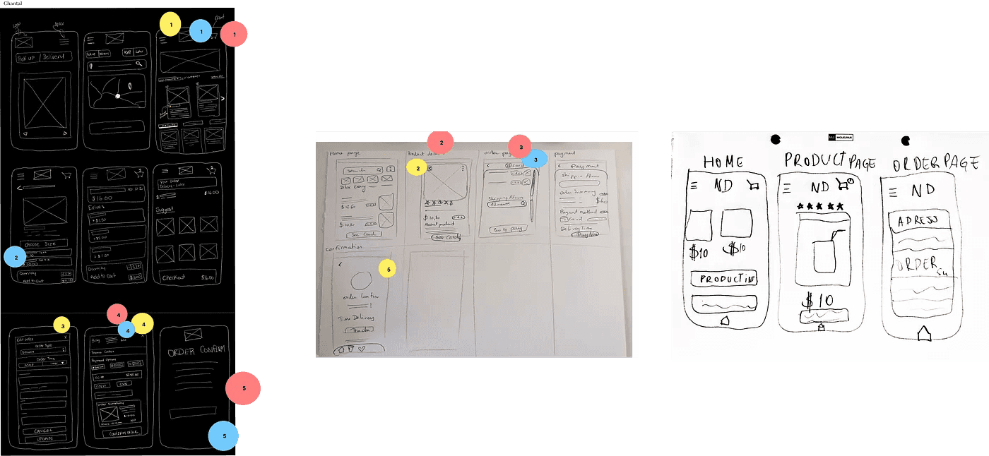
Lo-fi Wireframes
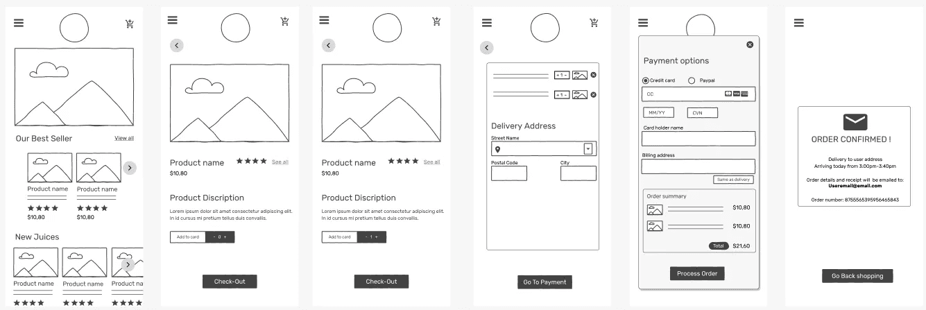
Mid-fi Wireframes
Reflections
Looking back, the biggest theme for our team was perfectionism. We often spent hours rewriting, refining, and debating even small details instead of moving forward. While this showed our commitment to quality and our eye for detail, it also slowed us down and sometimes kept us from exploring more ideas.
Through this, I learned a few key things:
Simplification is powerful. Overthinking can add layers of complexity that don’t help the user. The moments when we stripped things back to the essentials were always the clearest and most impactful.
Teamwork requires balance. We had a strong team dynamic, but our tendency to push for perfection meant we sometimes got stuck in endless loops. Learning to compromise and move forward was just as important as pushing for quality.
Design is translation. At the heart of it, our job wasn’t just to “design a website.” It was to translate Marsha’s personality, her energy, and her values into something users could feel online.
In the end, our perfectionism showed how much we cared, but it also highlighted the need to let go sooner. Progress, not polish, is what drives momentum in design sprints.
Final Thought
From public hospitals to juice bars, the lesson keeps repeating: great design isn’t about great UI, it’s about people, their stories, and how we can make their lives feel just a little bit better.
date published
Aug 18, 2025
reading time
5 min