Public Hospitals: UX Case Study

How can we make the whole experience at public hospitals feel smoother and better for everyone from start to finish?
Brief:
We started working with a brief of general improvement of an aspect of the public hospital service. We pivoted to the experience in public hospitals in Metropolitan France due to familiarity and personal experience on them. With this in mind, the key challenges we aimed to tackle were: excessive long waiting times, limited access to clear information, and the lack of proper instructions or follow‑up care after appointment.
Project Overview:
The overall project was divided in 3 major phases in a 1.5 week timeline:
Research by the way of (Secondary Research, User Interviews, User Persona and Problem Statement definition, and then User Journey), Ideation and Wireframing. I was part of a team with other 4 talented designers (Adama, Karen and Midoli), and we were able to accomplish our main goal in the project as well as push a little bit further to explore and learn experimenting with solutions at end.
Week 1: Research & Defining the Problem
In the first week we started by understanding the Challenge. Our first task was to uncover what patients actually experience when navigating public hospitals. To start, we reviewed articles, explored background, then built an interview guide to explore these experiences further. Over the week, we spoke with five participants and organized their feedback into thematic insights.
Through this process, three recurring pain points stood out:
Booking and finding doctors is a nightmare
Waiting times (especially in emergency rooms) feel endless.
The hospital environment makes people feel anxious, isolated, and stressed out.
My Role & Reflections
Having prior experience in user research was interesting to take a different approach and explore new ways of understanding our interviewees in a UX researcher perspective. We went through some issues during the interviews because some of our questions were a little bit uncomfortable for certain participants. After getting feedback we tried to improve and we learn that we are focused on user experiences, we should be “obsessed” by being user-centric, which means every single user, both during research and any point after, we should make them have the best experience ever.
Building Ana: Our Persona
With research insights in hand, we synthesised them into a single persona from a composite of the people we interviewed Ana Rana (Runner) and mapped her journey through the hospital experience. This helped us visualize not just her actions, but also her emotional state.
Press enter or click to view image in full size
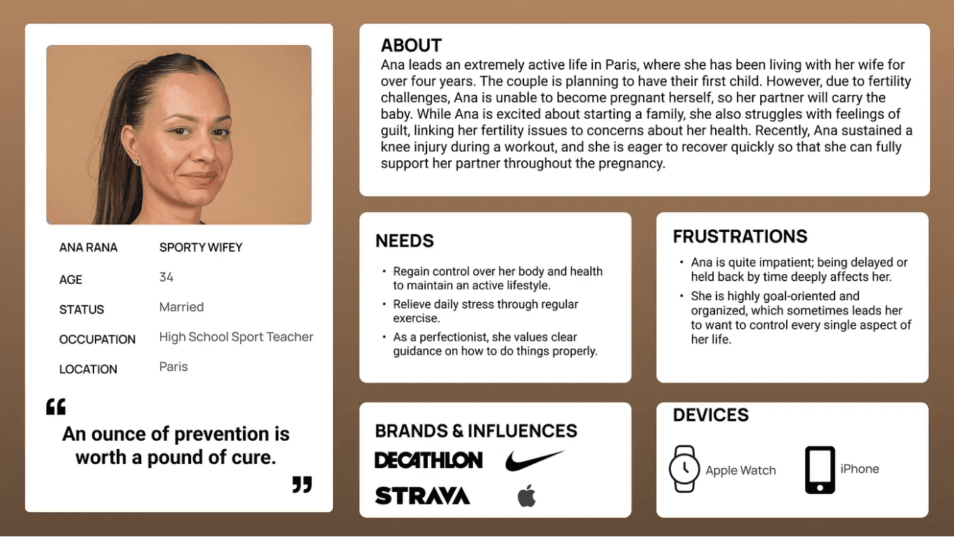
Ana Rana, Sporty Wifey User Persona
Problem Statement
Adults aged 20–50 living in French metropolitan areas, who are proactive about maintaining a healthy lifestyle, need clarity about their care, easier access to medical attention, and guidance on next steps because long delays and poor communication in hospitals often leave them feeling anxious and frustrated.
Key takeaway from Neil and Nicolly: Simplicity is powerful. A clear, focused persona and a straightforward journey map make pain points more visible and remind us not to neglect the emotional side of the problem when defining it.
Day 5 was all about ideas. It was the most energizing part of the week, however we shortly realize we couldn’t build everything. From our mentor Neil’s guidance and MoSCoW, we narrowed down features to essentials:
Quick online triage and guidance to the right hospital
Clear information with support for travel to site and real time waiting information.
We also defined some nice‑to‑haves, like mood tracking and hospital maps.
Week 1.5: Develop, Deliver & Present
With only two days left, we jumped into sketching paper wireframes individually, then merged the strongest ideas into one new and unique flow. We then tested the first iteration of the lo-fi wirefame with 4/5 users to understand their first experience.
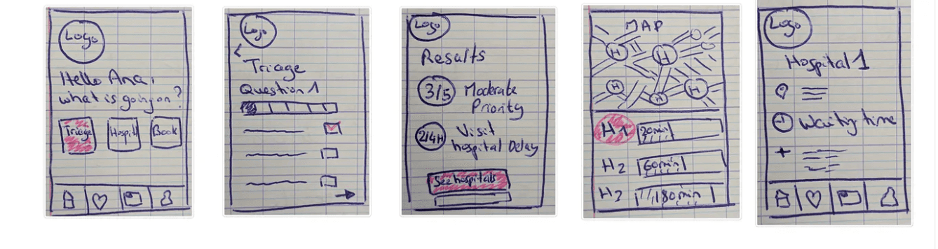
Lo-fi Wireframe V1
We learned from testing that:
Users doubted the recommendations “Why we should trust your triage, it could be inaccurate”
Travel and wait times mattered as much or even much as hospital quality. We were really commended by this key feature.
The term “triage” confused people.
These insights drove our low‑fidelity wireframe v2.
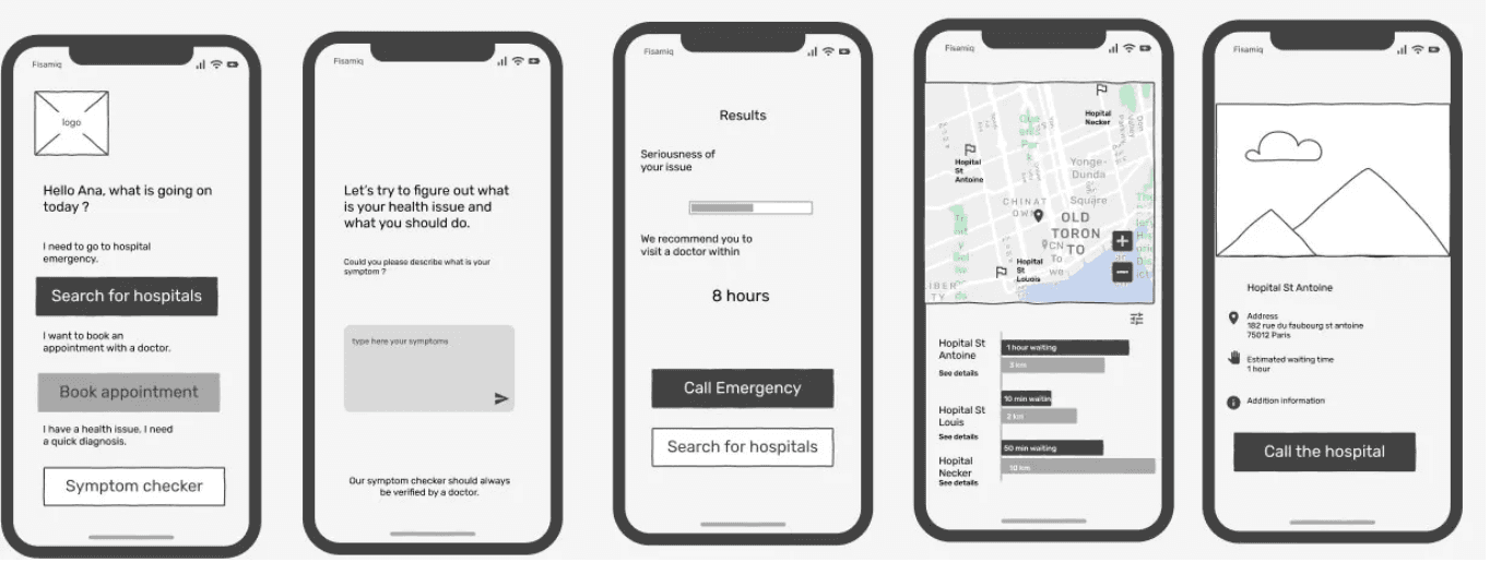
Low‑Fidelity Wireframe V2.
Presentation Day
By the final day, we were running on gear five. Presenting our concept to everyone felt crazy a week earlier, we had nothing but a vague brief; now we had a researched, tested, and structured prototype.
Feedback highlighted strengths (solid research, great solutions) and opportunities (simplify language further, tighten UI details).
Presentation Introduction
Reflections & Takeaways
This sprint was intense, but transformative, I had the pleasure to work with some great and talented designers, our ideas flowed together, we disagreed with each other, we agreed a lot, but mostly we deeply respected the brief and saw each other as a possible user which reflected on our general care for the project solutions. Some conclusions I reached at the end were:
“User problems matter as much than the solutions we want to give to them”. During this project we had a mindset to always and constantly to focus on the solutions. Like eveytime, everyday, thinking about the features. But as the project went, we learned that be obsessed about your user problems, “lose sleep about it”, only then we can understand why the solution is important to them.
Neutral listening is a skill. Empathy matters, but so does avoiding bias both positive and negative.
“Simplify”. Funny enough is simple as that.
Learn from teammates. Each person’s approach (from handling interviews to prioritizing features) influenced my own growth during this project. I became 99% better from day one just from interacting with some of the most intelligent, creative, goal-oriented individuals I ever met.
Above all, I learned to trust the process it was really messy sometimes, but being goal focused and tackling the problem step by step until clarity emerges is key.
date published
Jul 28, 2025
reading time
5 min


